Debunking claims of electoral fraud by Dr. Shiva Ayyadurai
In this post, I learned that someone on the internet was wrong, and decided to spend a good chunk of my weekend working, in the name of Democracy, to make some graphs proving him so.
I will debunk claims of evidence for electoral fraud made by Dr. Shiva Ayyadurai. I’m not going to dive too deep into details, and want to just make some quick hopefully clear points to show why Dr. Ayyadurai’s graphs aren’t really evidence of anything suspicious happening, for anyone who saw his video.
This is the graph Dr. Ayyadurai shows as evidence that an algorithm is stealing votes from Trump:
Each dot is a precinct in Oakland County Michigan. The x-axis is the % of straight ticket votes for Republicans. The y-axis is % of votes for Trump - % straight ticket Republican. The claim is that because the lines have a downward trend, this indicates that votes are being stolen from Trump and handed to Biden in the precincts that have a high percentage of straight-ticket Republican voter (1, <— see below if you want details. I’m incompetent and can’t find out how to use superscripts).
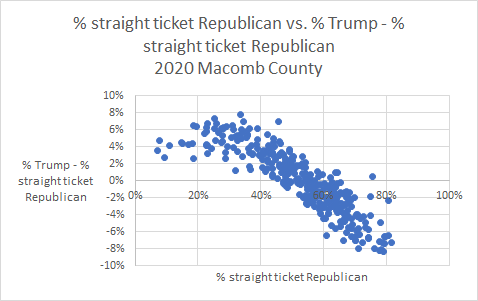
I’ve recreated the data using Macomb county, another county given as an example of fraud in his video (2):
According to Dr. Ayyadurai, the fact that this line slopes downwards is evidence that Biden is stealing votes from Trump.
But! Here’s another graph though, using the same county’s data:
Woah! It’s also sloped down. Those points in the bottom right are precincts that are mostly Democrats where it looks like Biden is doing way worse than Dr. Ayyudarai would expect. By his logic, that must mean that Trump is also stealing votes from Biden!
In fact, you can just hold a mirror up to all of Dr. Ayyudarai’s graphs to see a new graph that makes it look like Trump is stealing votes from Biden. Because a downward sloping line on these graphs is nothing suspicious — it’s just an artifact of the way Dr. Ayyudarai’s decided to display the data (3).
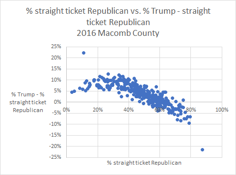
This kind of slope is just not that weird of a slope to see. We see the same trend in the 2016 election, where Trump won Michigan:
And we see the same thing again in 2012, when Obama carried Michigan over Romney:
So at the very least, if you think that Dr. Ayyadurai’s video is evidence of voter fraud, then you’d also have to believe that the same voter fraud happened in both 2012 and 2016 (4).
But there’s no reason to believe voter fraud of the type Dr. Ayyadurai claims is happening, or that widespread voter fraud is an issue in US national elections. If widespread voter fraud is happening, that would be a huge problem, and it’s not impossible that data would come to light that shows that it is happening. But for now the evidence shows that voter fraud was not a problem in any state this year. If you learn of any evidence making you think that widespread voter fraud is an issue, I’d love to hear it.
I don’t know anything about Dr. Ayyadurai, besides what I’ve seen in this video so can’t really say if he’s being deliberately deceptive here, or just foolish in his use of data. But please don’t believe stuff people post online just because they use graphs and have a degree from MIT (5).
1. As an aside, this is a very confusing way to make a graph. If he really wanted to communicate clearly, he would just show % of votes for Trump on the y-axis. The fact that he subtracts out % straight ticket Republican is what gives us a downward sloping line that makes it look like something is fishy. He could be less confusing by showing the data like this:
This is the exact same data as shown in my first graph. Now it doesn’t look like much is wrong. More people vote for Trump in the precincts that have more straight ticket Republican votes. Just as we would expect.
2. Note that my y-axis doesn’t exactly match the one used in the video — I’m not sure exactly what the difference is — Dr. Ayyudarai isn’t the most clear with exactly what is plotted on the y-axis. But the overall point is the same.
3. See 1
4. But what about that “flat line” that Dr. Ayyaduri draws in the 0-20% zone? Why don’t we see that in the 80-100% zone? Isn’t that an indication that something different is happening in precincts with tons of Republican straight ticket voters? No. Because we just don’t see that many precincts at all that have 80% or more straight ticket Republican voters. If there were, I’d expect the points to flatten out just as they do in the 0-20% zone.
The reason it slopes downwards is because in every district, the people who don’t vote straight ticket are going to be more moderate than the people who vote straight ticket. So in a super Republican precinct, you will expect that the people who bubble in each candidate themselves are going to vote for Biden more often than the people who vote straight ticket, putting you in the bottom right of Dr. Ayyudarai’s charts. And in a super Democratic district, the people who want to bubble in each candidate probably vote for Trump more often than the straight ticket voters, putting you in the top left of Dr. Ayyudarai’s charts.
5. Macomb data source (and 2016). Oakland data source. I’m happy to share my analysis if anyone in the world is interested. I pick the years and counties I do because those were the countries and years for which data was available that allowed the most direct comparison with Dr. Ayyudarai’s graphs. Thanks to my roommates for your help thinking this through!
If you aren’t convinced by me, or are interested in learning more, this good Medium post, written by Naim Kabir has some more detail on the mistake Dr. Ayyadurai is making. Kabir makes points using simulations rather than election data.
Edit: The original version of this post said that those who didn’t vote straight-party must have voted split ticket. This is not correct, and the text has been updated. Thanks to Jeff Brewster for pointing this out.


